D3 实践
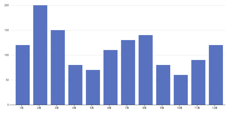
柱状图
js
const data = [
    { label: '1月',value: 120 },
    { label: '2月', value: 200 },
    { label: '3月', value: 150 },
    { label: '4月', value: 80 },
    { label: '5月', value: 70 },
    { label: '6月', value: 110 },
    { label: '7月', value: 130 },
    { label: '8月', value: 140 },
    { label: '9月', value: 80 },
    { label: '10月', value: 60 },
    { label: '11月', value: 90 },
    { label: '12月', value: 120 }
]

const svgWidth = 960
const svgHeight = 500

// 定义图幅大小
const margin = { top: 50, right: 50, bottom: 50, left: 50 }
const chartWidth = svgWidth - margin.left - margin.right
const chartHeight = svgHeight - margin.top - margin.bottom
// 创建 svg
const svg = d3.select('svg').attr('width', svgWidth).attr('height', svgHeight)
const chart = svg.append('g').attr('transform', `translate(${margin.left},${margin.top})`)
// 定义比例尺
const xScale = d3.scaleBand().domain(data.map(d => d.label)).range([0, chartWidth]).padding(.2)
const yScale = d3.scaleLinear().domain([0, Math.max(...data.map(d => d.value))]).range([chartHeight, 0])

// 添加x y 轴
chart.append('g').attr('class', 'x-axis').attr('transform', `translate(0, ${chartHeight})`).call(d3.axisBottom(xScale).tickSizeOuter(0))
chart.append('g').attr('class', 'y-axis').call(d3.axisLeft(yScale).ticks(5))
// 优化 y 轴样式
chart.selectAll(".y-axis .tick line")
    .filter((d, i) => i > 0)
    .attr("x2", svgWidth - margin.left - margin.right)
    .attr("stroke", "#aaa")
    .attr("stroke-width", .4)
chart.select(".y-axis path")
    .style("display", "none")
// 添加柱子
// 获取每个柱子的宽度
const columWidth = (xScale.bandwidth() / 12)
chart.selectAll('.group')
    .data(data)
    .join('rect')
    .attr('class', 'group')
    .attr('fill', '#5671c3')
    .attr("width", xScale.bandwidth())
    .attr("height", d => chartHeight - yScale(d.value))
    .attr("x", (d) => xScale(d.label) + columWidth)
    .attr("y", d => yScale(d.value))
    .on('mouseover', (e) => {
       d3.select(e.target).style("opacity", "0.9")
    })
    .on("mouseout", (e) => {
        d3.select(e.target).style("opacity", "1")
    })
给柱状图生成添加上动画
js
chart.selectAll('.group')
.data(data)
.join('rect')
.attr('class', 'group')
.attr('fill', '#5671c3')
.attr("x", (d) => xScale(d.label) + columWidth)
.attr("y", chartHeight)
.attr("width", xScale.bandwidth())
.attr("height", 0)
.on('mouseover', (e) => {
d3.select(e.target).style("opacity", "0.9")
})
.on("mouseout", (e) => {
d3.select(e.target).style("opacity", "1")
})
.transition()
.attr("height", d => chartHeight - yScale(d.value))
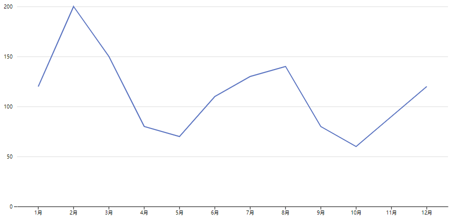
.attr("y", d => yScale(d.value))折线图
js
const data = [
    { label: '1月',value: 120 },
    { label: '2月', value: 200 },
    { label: '3月', value: 150 },
    { label: '4月', value: 80 },
    { label: '5月', value: 70 },
    { label: '6月', value: 110 },
    { label: '7月', value: 130 },
    { label: '8月', value: 140 },
    { label: '9月', value: 80 },
    { label: '10月', value: 60 },
    { label: '11月', value: 90 },
    { label: '12月', value: 120 }
]

const svgWidth = 960
const svgHeight = 500

// 定义图幅大小
const margin = { top: 50, right: 50, bottom: 50, left: 50 }
const chartWidth = svgWidth - margin.left - margin.right
const chartHeight = svgHeight - margin.top - margin.bottom
// 创建 svg
const svg = d3.select('svg').attr('width', svgWidth).attr('height', svgHeight)
const chart = svg.append('g').attr('transform', `translate(${margin.left},${margin.top})`)
// 定义比例尺
const xScale = d3.scaleBand().domain(data.map(d => d.label)).range([0, chartWidth]).padding(.2)
console.log(data.map(d => d.label))
const yScale = d3.scaleLinear().domain([0, Math.max(...data.map(d => d.value))]).range([chartHeight, 0])

// 添加x y 轴
chart.append('g').attr('class', 'x-axis').attr('transform', `translate(0, ${chartHeight})`).call(d3.axisBottom(xScale).tickSizeOuter(0))
chart.append('g').attr('class', 'y-axis').call(d3.axisLeft(yScale).ticks(5))
// 优化 y 轴样式
chart.selectAll(".y-axis .tick line")
    .filter((d, i) => i > 0)
    .attr("x2", svgWidth - margin.left - margin.right)
    .attr("stroke", "#aaa")
    .attr("stroke-width", .4)
chart.select(".y-axis path")
    .style("display", "none")

// 画线
const lineGenerator = d3.line()
    .x((d, i) => xScale(data[i].label)  + xScale.bandwidth() / 2)
    .y(d => yScale(d))
    // .defined(d => d !== null) // 防止缺少数据导致折线断裂

const line = chart.append('path')
    .datum(data.map(d => d.value))
    .attr('class', 'line')
    .attr('d', lineGenerator)
    .attr('stroke', '#5671c3')
    .attr('stroke-width', '2')
    .attr('fill', 'none')
折线图动画主要考 svg 的两个属性 stroke-dasharray 和 stroke-dashoffset
stroke-dasharray 属性定义了对虚线的描述。例如,如果设置 stroke-dasharray: 5 5,则表示在路径中每 5 个像素绘制一个实线,然后 5 个像素留空,然后再 5 个像素绘制一个实线……如此反复。
stroke-dashoffset 属性定义了虚线的起始位置,也就是虚线距离路径起始点的偏移量。例如,如果设置 stroke-dashoffset: 5,则表示路径虚线的起始点向路径起始点相对偏移 5 个像素。
js
line.attr('stroke-dasharray', function () {
        return `${this.getTotalLength()} ${this.getTotalLength()}`
    })
    .attr('stroke-dashoffset', function () {
        return this.getTotalLength()
    })
    .transition()
    .ease(d3.easeLinear) // 过渡效果
    .delay(500)
    .duration(1000)
    .attr('stroke-dashoffset', 0)
在上面的代码中,首先通过获取 getTotalLength() 方法获取路径总长度,然后将 stroke-dasharray 属性设为该长度值的两倍,因此实现了完全隐藏路径线段的效果。接下来通过设置 stroke-dashoffset 的初始值为总长度值,实现了路径从一开始完全隐藏的效果。最后通过过渡效果和延迟设置,使得路径从隐藏状态逐渐展示出来,从而实现了路径动画效果。